


The Meaning behind the 25 Best and Unique Famous Logos – Logos are a major part of branding. A logo is a symbol or symbol that describes the characteristics of goods, institutions, companies, agencies, websites or blogs. A logo is said to be good if people who see it will immediately relate to the product. This is why a logo is designed strongly and is designed in stages so that it can communicate the brand well.
Read: How to get rid of the WordPress Logo in the Admin ToolBar
But many people make logos with no meaning or just symbols, but some clever people will create logos by giving messages so that they can be captured by users. For those of you who are having trouble making a cool logo easily, you can try a free tool for making logos online at Logaster free logo maker and Generator. With logaster you can create a logo for your company or for various other logo needs in just 4 steps in just a few minutes with amazing results, besides that in logaster you can download for free for low res logos and can download high res logos with starting prices $ 9.99 only.
By using the Logaster tool you can create amazing logos such as the best logos which I will show in the best and famous logos list below. In the following I’m going to show you 25 of the best and famous logos that have meaning.
1. Amazon
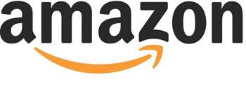
Amazon is the largest online store in the world today, the Amazon logo is the best logo which is intended to convey a vast directory of storage. This is further indicated by the arrow connecting the letters ‘A’ to ‘Z’ which is meant to tell them that they have everything from ‘A’ to ‘Z’. Which you can find on their site, and the meaning of the double arrow becomes visible as a smile.
2. FedEx
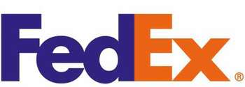
FedEx is a shipping company, on the best and most famous logo of FedEx it looks as simple as its name. But if you look both in the space between ‘E’ and ‘X’, you will see an arrow, so perfectly placed there, the point of the arrow is to represent the speed and percision of the company.
3. Sony VAIO
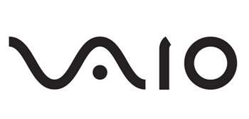
VAIO is the name of Sony’s laptop. The Viaio logo is not just a stylized brand name but refers to converting analog waves into digital form. Analog waves are represented in ‘V’ and ‘A’. ‘I’ and ‘O’ on the other hand can also refer to 1 and 0, which are the two digits used in digital binary code.
4. Sun Microsystems
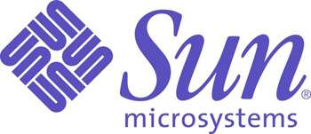
This best and famous logo was designed by computer science professor Vaughan Pratt. Despite having no designer blood, Pratt manages to come up with a clever design by making the Sun logo ambigram, which is a typographic design that spells words in multiple directions.
The logo is of design even if you rotate the direction, you can still read the word “Sun”.
5. Hershey
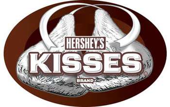
Hershey Kisses is so much fun to offer people the line: “Would you like a kiss”
Turn the logo on the side and you might just see a (brown) kiss between the ‘K’ and the ‘I’.
6. Carrefour
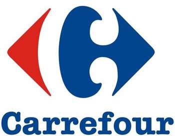
The popular French hypermarket name Carrefour translates to mean a crossroads. Therefore the red and blue arrows point in different directions. If you pay close attention, you will be able to see the clever ‘C’ being entered through the use of negative space.
7. Northwest Airlines
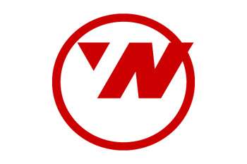
It used to be the Northwest Airlines Logo before 2003. Put simply, this logo is well designed by making use of negative space to convey the letters ‘N’ and ‘W’ at the same time. The triangles placed in the ring also suggest a compass image, with the triangles pointing towards the northwest.
8. NBC
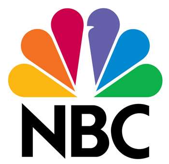
NBC was known for having the peacock logo when the bird was first used as a logo in 1956. Later the best NBC logo was similar to a peacock with 6 colored tails representing the department; News, sports, entertainment, Stations, Networks, and Productions.
In addition, the peacock is depicted facing right to show that the television network is looking towards the future.
9. Goodwill
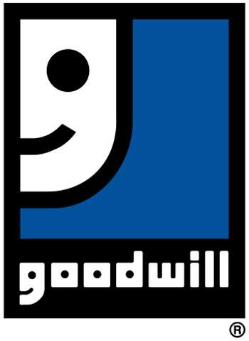
As a non-profit organization helping the less fortunate, it’s easy to see that the Goodwill logo featuring a smile means that the organization is helping them to be better off.
If you take a closer look at the letter ‘G’ you will also see an image of a half smiling face. Now you are more inclined to see the logo with the letter ‘G’ or a smiley face?
10. Toblerone
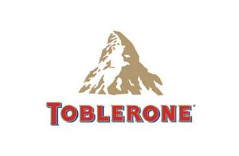
The Toblerone logo is much more complex than Hershey’s. If you look at the logo normally you will only see mountains, but if you look closely you will see bears too. The reason for this is because the Swiss chocolate company originates from the city of Bern, Switzerland which is also known as the City of Bears.
11. Le Tour de France
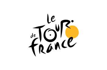
The name of the strong annual cycling competition is not the only feature in this logo. Take a closer look at the letter ‘R’ and the yellow circle beside it. You will be able to see a cyclist in a racing position. In addition, the yellow circle can also represent the sun to indicate that the race is taking place during daytime.
12. London Symphony Orchestra
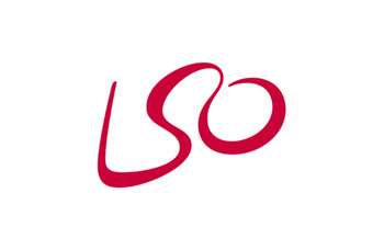
At first glance, this might appear to be a simple logo made up of only the shorthand letters that make up the London Symphony Orchestra.
But if you take the trouble to visualize, the wavy lines also bring out the abstract image of the conductor waving his wand.
13. MyFonts
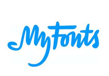
MyFonts is the source of fonts for all font needs. Being a font resource site, they should walk the talk by having a customized font as their logo. And what better way to do that than by having a ‘My’ styled look like a hand too? You know, to show that you can get the font on the font you need.
14. Facebook Places
Anyone remember Facebook Place? Considered a direct competitor to Foursquare, all you have to do is take a closer look at the logo design. Primarily a rectangular grid meant to represent a map. Do you only see the line, or do you also see the number 4?
15. Spartan Golf Club
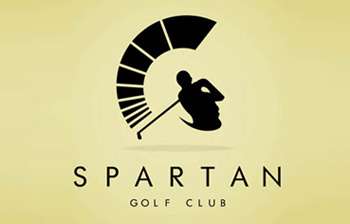
Like most of the logos on this list, this logo tries to represent its name. And it’s not good with representing 2 things in a logo. The first has a golfer swinging, to represent his club. With the use of negative space, the second has the side profile of a Spartan warrior.
16. Cluenatic
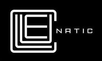
If you can’t guess from the name, Cluenatic is a puzzle game. And the puzzle game needs a puzzle as its logo. Here, the lines that make up the word ‘Clue’ are arranged to look like a maze. Also when you look at the logo as a whole, you will see the key shape.
17. Cisco
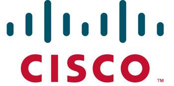
Cisco is well known for designing, manufacturing, and selling network equipment. It is therefore not surprising that they decided to set up a digital signal illustration in their best logo.
But there are other meanings besides digital signals. It even looks like the abstract of San Francisco’s famous golden gate bridge. By choosing this design, Cisco managed to both convey what they do and where they are.
18. Eighty 20
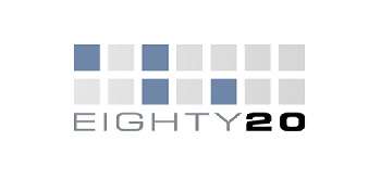
At first glance, you might think that this company’s data logo consists of just a random grid arranged into 2 lines. In fact, the box is really binary code with the top being 1010000 and the bottom being 0.010.100.
The binary code forms the numbers 80 and 20. When collecting them they form a company name. You get extra addict points if you manage to figure it out without the help of this explanation.
19. Nintendo Gamecube
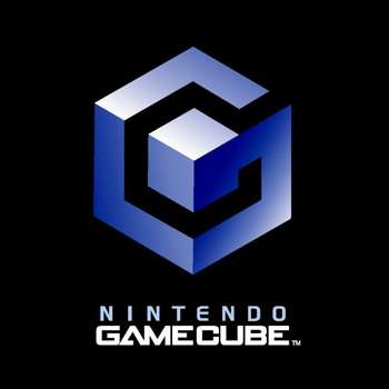
I’m sure anyone will agree that this is a good logo with a clever play of the cube-conception. But it will get even smarter. If you look at it this way, the blue line also forms the letter ‘G’ and the black space between the ‘C’ shapes. And what do they represent? That’s right, Gamecube.
20. US Cyber Command
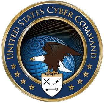
Why is this logo here? It looks like every ordinary government logo. That’s what the United States Cyber Command would like you to think. Take a closer look at the inner gold ring and you will find 32 characters.
The meaning of the characters is a little difficult to decipher. Many have speculated that Cyber Commmand’s mission statement was encrypted in a 32 character code. As for the meaning of the logo, Many say it’s the US Cyber Command’s long paragraph mission statement encrypted in an MD5 hash code.
21. Microsoft XNA
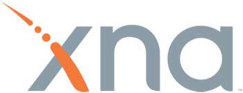
XNA is a set of tools Microsoft came up with for game development. The orange dashed line that makes up one of the ‘X’ strokes is actually Morse Code spelling out XNA. _.._ is X, _. is N, and ._ is A.
22. Picasa
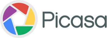
Google’s image editing and sharing sites don’t just represent camera shutters. The name Picasa is a play on the concept that the site is the home for your photos. Casa in Spanish is translated to home. Now you see a house amidst colorful windows or do you see a house?
23. Rdio
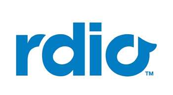
Rdio, although lacking an ‘A’, offers a streaming radio service as its name suggests. The cutely logo uses the space in ‘D’ and ‘O’ to contain musical notes; a semibreve and crochet each.
24. The Bronx Zoo
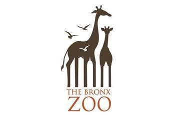
The Bronx Zoo can be found in New York City. Of course being a zoo, they will use animals (in this case giraffes and birds) in their logo designs. But look at the giraffes’ two legs and you’ll see the New York CityLine through the space between the legs.
25. Pittsburgh Zoo
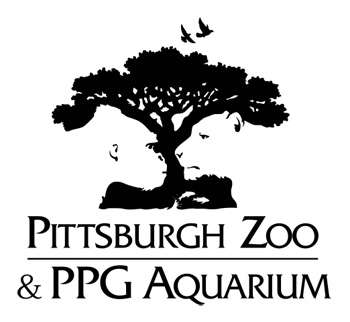
American zoos sure love to use negative space in their designs. And they do it beautifully, as the best logo of the Pittsburgh Zoo in Pennsylvania shows.
If you don’t see it, there are gorillas and lions staring at each other from the side of the tree.
Here are 25 of the best logos that are well-known and with good designs, hopefully they can inspire you to create a unique logo that has meaning. 🙂
Where to Look for a Good Logo Design Service?
If you do not have design skills, then there are many alternatives that you can use to have a good and beautiful logo. You can create a logo online for free using the free tools provided on several websites which you can see in the following articles:
And the second option is to find a service that offers logo design services, and I will give you where you can order logo services that provide low prices and produce a good logo. You can order the logo on theFiverr service. Where Fiverr provides many creatives that offer logo design services with prices ranging from $ 5.
You can order logos from the services they offer, to find which one is the best, of course you have to see their ratings and read their comments. Apart from that, they also offer logo revisions if it doesn’t really suit your fancy. Creating logos with prices starting at $ 5 is certainly a very cheap price. Because there are so many people offering their services at high prices even up to millions for one logo. To make your search easier, please click the link below and you will immediately be faced with many choices of creatives who offer logo design services.

